Have you ever visited a website on your smartphone only to find yourself pinching, zooming, and squinting to read the text? Did you stay and buy, or did you leave immediately?
If you left, you aren’t alone.
In Singapore, where smartphone penetration is among the highest in the world, over 90% of users browse the web primarily on mobile devices. If your business relies on a “desktop-first” website that merely shrinks down for phones, you are effectively turning away customers at the door.
This guide explains why Mobile-First Web Design is no longer just a trend—it is a business survival strategy for brands that want to rank higher on Google, build trust, and stop wasting ad budget.
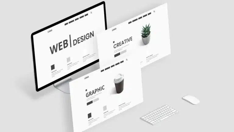
Mobile-First vs. Mobile-Friendly: Knowing the Difference
Many business owners confuse these two terms, but the difference is critical to your success.
- Mobile-Friendly (Responsive): This is a desktop site that attempts to squeeze itself into a smaller screen. Elements are often rearranged as an afterthought.
- Mobile-First: This is a strategy where the design starts with the mobile experience. We build for the smallest screen first—prioritizing speed, clarity, and usability—and then scale up for desktops.
It is a strategy, not a patch.
Since 2019, Google has used Mobile-First Indexing. This means Google ranks your website based on its mobile version, not the desktop version. If your mobile site is slow or clunky, your SEO rankings will suffer, no matter how beautiful your desktop site looks.
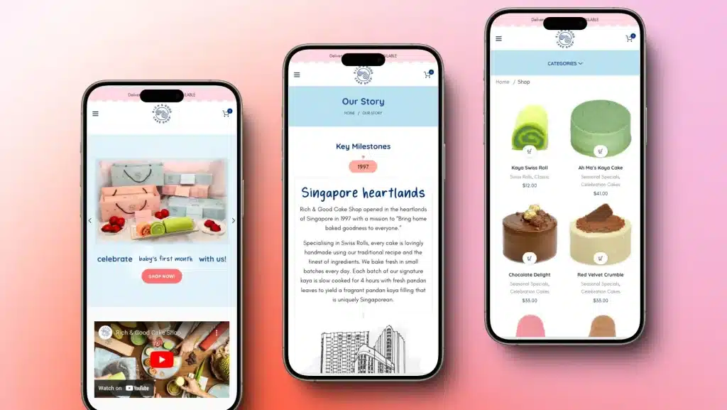
What a True Mobile-First Experience Looks Like
A properly executed mobile-first website respects the user’s time and context. Here is how it differs from standard designs:
1. Content Hierarchy
Mobile screens have limited real estate. We don’t force users to scroll through endless fluff. The most critical information—your value proposition and “Buy Now” or “Contact Us” buttons—is front and center.
2. The “Thumb Zone” UX
Navigation is designed for human fingers, not mouse cursors. Buttons are sized appropriately to prevent “fat-finger” errors, and key interactive elements are placed within the natural reach of a thumb.
3. Blazing Fast Speed
Mobile users are often on 4G or commuting. Mobile-first design eliminates bloated code and optimizes images (using modern formats like WebP) to ensure the site loads instantly.
4. Focused Action
Every page is designed with a single goal: to get the user to convert. Whether it is filling out a form or making a call, the path is friction-free.
The Cost of Ignoring Mobile: Why Singapore SMEs Can’t Wait
If you are running a business in Singapore, you cannot afford to ignore mobile optimization. Here is the reality of a poor mobile experience:
- You Bleed Ad Budget: You might be paying for clicks, but if your landing page loads slowly on mobile, users will bounce before they even see your offer.
- Lost Credibility: A broken or difficult mobile site tells customers that your business is outdated. In fact, 61% of users are unlikely to return to a mobile site they had trouble accessing.
- SEO Penalties: Google will silently lower your search rankings if your mobile usability scores are low.
60-Second Self-Audit: Is Your Site Failing?
Grab your phone and test your current website right now. Be honest.
- Does it load in under 3 seconds on mobile data?
- Can you find the contact number or WhatsApp button instantly?
- Is the text readable without zooming in?
- Can you navigate the menu easily with one hand?
- Do you understand what the business offers without endless scrolling?
If you answered “No” to any of these, your site is likely leaking revenue.
How Web Design Singapore (WDSG) Builds Differently
At Web Design Singapore (WDSG), we don’t just make websites “responsive.” We build them with mobile at the core of our strategy.
With over 500 successful projects locally, our approach is tailored to the Singapore market:
- Performance-First Architecture: We write clean code and optimize assets specifically for fast loading on local networks.
- Thumb-Centric Design: From wireframing to launch, we test every interaction to ensure it feels natural on a touchscreen.
- SEO Integration: Schema markup, meta tags, and structure are built-in from day one to help you rank.
- Conversion Focus: We design layouts that guide visitors toward becoming paying customers.
Ready to Stop Losing Mobile Customers?
A great website is your best salesperson, available 24/7. But it only works if your customers can use it easily on the device they use most.
Web Design Singapore (WDSG) helps you transition to a mobile-first powerhouse without the headache.
- We can assist with aligning projects to government grants.
- All work is done in-house (no outsourcing).
- We provide structured post-launch support (30/60/90 days).
Don’t let a clumsy website hold your business back.
Book a free strategy call with WDSG today. We will audit your current site, identify the friction points, and show you exactly how to capture the mobile market.